Tuesday 27 April 2010
Friday 23 April 2010
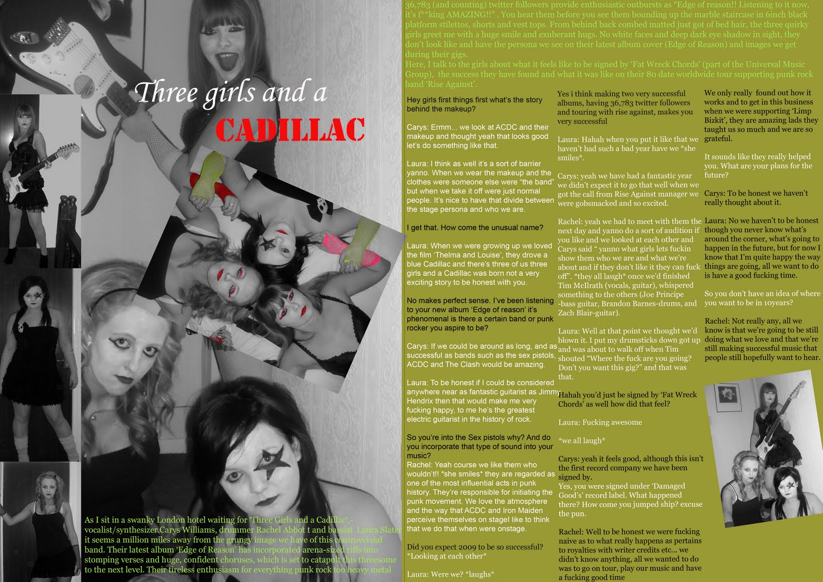
FINISHED: Front Cover, Contents Page and Double Page Spread

This is my finished copy of my contents page, the dowdy green i thinks also links in with the image that i was going for of the grungy look. I decided to leave the bottom half of the page entirely to copy for the reader so that they know where things are, what page etc.

This is my finished double page spread, I decided on an exclusive interview with the band.
Thursday 25 March 2010


Monday 15 March 2010
Mock Shots
I decided not to use this image as the light of the camera flash is shining off the guitar, and makes it seem fuzzy. The door is in the shot of the camera as well as the lamp behind. My actress is looking down and not at the camera or at the guitarist.

 i decided not to use these photos for my punk rock band as i feel that the lighting isn't right as the one light in the left hand corner makes his face seem blurry. The positioning of my actors make them seem distant from each other.
Venue release forms.


Photo Shop Practices


Thursday 11 March 2010


Monday 1 March 2010
 For my music magazine i think i am going to use this sort of positioning of my actors as i like the idea of the lead singer being the main focus of the photo, yet the other band members seem as improtant, this is done by forming a triangle shape.
Monday 22 February 2010
Collage magazine

Thursday 18 February 2010
Mood Board
 As part of my research i have to develop a mood board. Mood boards are created to develop design ideas and to let my audience know which direction my project is going to take. Using the mood board above which i have created shows the idea's, clothes, stereotypes etc of the genre which i have chosen, punk rock.
Wednesday 10 February 2010
2 Contents page and 2 Double page spread analysis
 The whole point of a contents page is to give the reader an insight into what is in the magazine, so this is why it needs to be simple to follow just like the one above. The font design and colour is simple and easy to read. With the contents being split into sections it makes it easy for the reader to find out what they are looking for, and with the white background it doesn't distract the reader from the copy. With the image of Astoria being in the centre gives it the main focus and tells us the it is something important. We know that it is important by the anchorage text underneath. With the "band index" on the contents page in bold writing is convenient for readers, and for one off buyers that have been attracted to images of bands that they are interested in. There are also puffs next to some of the features to tell the reader that this is what page the story that was in the front page is on. The subscription information in the bottom left hand side of the page stands out against the white background and grab the readers attention into subscribing. With the arrow in the right hand corner being in red, draws the reader in and also gives them an insight into why it is important.
2nd Contents page

 (Image from Kerrang website or Click Here)
  The layout of the double page spread is split into six columns.To go with the house style of the Kerrang magazine neither the text or the images are taking the focus.This make the article easier to read and also breaks the text up. The first part of the article (the lead) starting with a drop capital consists of setting the scene of the location, where the interview is taking place, the tour figures and a little history of the band. The article is a question answer interview its structured around the bands tour. Its quite smutty but has a humour to it. We see an insight into the personalities of the band members and what life is like for them in the "rock and roll" world. The whole interview is hyped the excitement of their tour.The style is very informal like a chat between friends. The pull out quote in the puff is eye catching, the contrast of the black circle with white writing, the stars surrounding the text links into the drop capital as that also has a star around it. The light blue of the stars connects that to the questions asked in the article.The simple white background with the black copy i think is a good comparison, it may seem as though the page is quite empty, plain but i think the pictures draw your attention away to this fact. The images are are quirky and natural it seems as though their life is just one big party. With the anchorage text we see the personalities of the band members.
 Tuesday 9 February 2010


Thursday 28 January 2010
Research

Which magazine? OK
Target audience? Late teens/women
Why? The magazine is very squared off and boxey. The magazine is aimed at slightly younger women compaired to Hello magazine. OK is more celebrity, gossipy baced magazine.
Mag 2

Semiotics
Wednesday 27 January 2010
Semiotics classwork
 Image from click here
The image represents Misery, rain, sadness, storm, love, romantic scenes.
 This image is from click here. This image represents happiness, joy, warmth, holiday, beach, skin cancer.
 Image taken from-Rave Magazine
This image is from click here. This magazine cover seems as though it has allot of images and things going on, but the way it is arranged is clean and slick. The colours used are vibrant and link in with each other. The headline (100 GREATEST GIGS EVER!) is in big block capital white writing it's eye catching and seems as though it has been stamped on, it gives the issue a graffiti look. The Masthead (Kerrang) and the motto 'Life is Loud' has the same consistancy as always the white writing in the masthead and the motto in red, this gives the readers a sense of familularity there more likely to keep buying the magazine as the name is so recognisable. The housestyle of the whole magazine seems to be vibrant yellows for the boxes around the pictures, the sub heading 'Your votes are in! and the winners are' and the bands across the top. The greeny misty look on the background all give the feel of being at a music concert, linking in with the main headline.
Research for school magazine
Buzz words- "WOW","Exclusive", "Free" are examples of this.
Puffs-Colourful boxes promoting features inside.
House style-A magazine's distinctive design that distinguishes it from its competitors.
Strap Line- A slogan
Banner- Text which stands out on a coloured background generally at the bottom of the
magazine.
Copy- The main story on the magazine.
Anchorage Text- The way in which text helps to pin down meaning of a picture and vise versa.
Pugs-Placed at the top left and right corners of the paper and are known as the "ears" of the page. The price of the paper, logo or promotion are often positioned there.
Motto- Memorable phrase that is recognised to a brand.
Headline- Catchy title for the main article.
Sell Lines- Text on the front cover that helps to sell the magazine to the audience.
Caption-Description of the main image.
Masthead- Name of the magazine.
Lead-The introductory paragraph of an article. Usually written in bold or capitals.
Drop Capitals-Really big letter that starts off an article.
Collage Contents page mockup

 We also looked at the Deyes High newsletter to see imperfections and how we would improve them.
Deyes High newsletter
It's quite boring- One colour, no grabbing image, just the badge on front.
Logo is faded
No shape to layout
No masthead
No variation for editors- house style
Its more like an Information booklet
Booklet image from Deyes High School.

I would have the Deyes high badge as waterbase, the image of the school in the corner. And the science collage logo in the corner. All these changes is just to make the newsletter more eye catching.
All images shown including school, science collage logo, image in the middle are from Deyes High website.

We also looked at Archbishop becks newsletter to look at the comparison between them. (Image taken from Archbishop Beck Catholic High School).
As you can see there is alot more colour, its more vibrant yet still has the same important information that is needed. It is set out as a magazine which will encourage the students to read. The whole newsletter is very eye catching.
Questionnaire
Anyone can answer my questionnaire so if you could take a few minutes i would appreciate it Thank you!
Please click here to go straight to my questionnaire.
Monday 18 January 2010
Welcome to my first blog!
I have to produce a frount cover for a Music Magazine containing a contence page and double page spread. I have consisted a plan for my reasearch to help me to manage my time properly, and so that i know exactly what i need to do.
Choose my genre
Product Research x2
Questionnaire
Analyse a school newsletter
x2 frount covers
x2 contents
x2 Double page
Collage magazine front
Mood board
Mock ups of magazines